Looking for the original Bar Towel blog? You can find it at www.thebartowel.com.
We have a trivia question in order to register to prevent bots. If you have any issues with answering, contact us at cass@bartowel.com for help.
Introducing Light Mode! If you would like a Bar Towel social experience that isn't the traditional blue, you can now select Light Mode. Go to the User Control Panel and then Board Preferences, and select "Day Drinking" (Light Mode) from the My Board Style drop-down menu. You can always switch back to "Night Drinking" (Dark Mode). Enjoy!
Belgian wrote:Well Grand River no longer looks like it's brewed by small children. Which is good.
I think GLB's silk-screened bombers can look very Rogue-ish. I'm talking the Oregeon brewery that pumps out Dead Guy and Brutal IPA. Not complaining though, GLB Bitter Wife looks great.
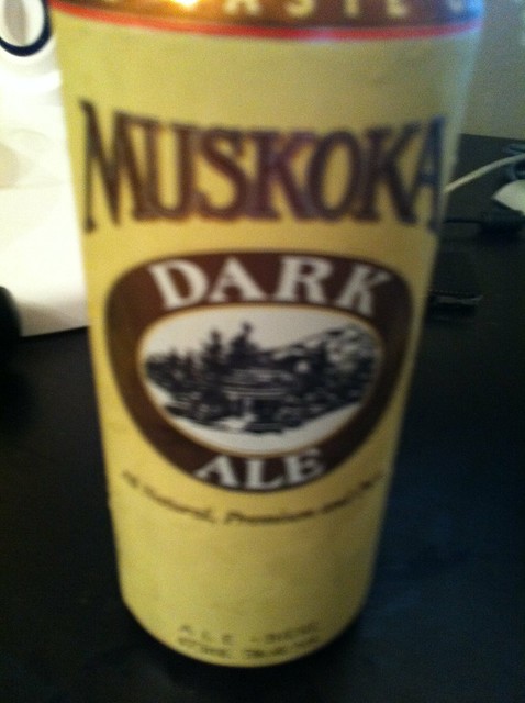
While not as recent, I've always thought the Muskoka rebranding (from Cottage Brewery to Craft Brewery) was one of the more astounding. Whenever I show someone an old Muskoka Dark Ale can, they are surprised that the first brewery to do a large release LCBO double IPA looked like this a few years ago.
They seem to have been well ahead of the rebranding a local craft-lager factory into an American-style craft brewery trend.
lister wrote:
Grand River still looks bad. Maybe not small children anymore but 13 year olds. My brother-in-law, who is a brand designer and has won awards for his packaging, has tried to see if they're interested in a design that looks like it was made by an adult but GR wasn't interested. That feeling became mutual after a visit to the brewery and casually chatting with an employee there.
GRB definitely has the shittiest labels. That story about your BIL is funny because I actually heard the same story from someone here (in Brantford) who has a friend that offered to re-design for them as well. Oh well, their loss (it really is).
On the bad branding, I have never liked the look of the boxes/labels from Barley Days. I try not to be someone who cares about the look of a beer package, but man oh man nothing is appealing to me looking at the BD stuff.
Not a redesign story, but to me by far the best packaging in Canada is DDC. You look at any of their dozens of labels and you instantly know whose beer it is. Beau's is a close second for me.
I really dislike the new GLB look on the big bottles, but to each their own, I get that. At least they have a common look and feel now. The sooner they transmit that to the cans and get rid of the ugly Crazy Canuck and Red Leaf packaging, the better.
One that really bugged me lately... I was in Sherbrooke, QC and spent some time at Bilboquet. I have no idea who thought it was a good idea to have a brand then split into three distinct brands (Hildegaard, plus whatever the other two are called). It makes absolutely no sense, and their big beer board inside is needlessly confusing.
I personally don't mind the terrible 'early' Grand River label style because it gives the brand a 'Garagiste' appeal - ie. like winemakers in France who make superior but 'illegal' regional wines for a private network of buyers.
The new ones that look less like a 1980's dot matrix printer labels are still pretty goofy I guess. Like they covered up aging stucco brick with cheap aluminum siding.